As much as I have appreciated the simplicity, low cost, and generally satisfactory results of low cost index funds in some of my accounts over the past few decades, I still see many advantages in accumulating individual stocks. On some occasions when I have mentioned “individual stocks” to colleagues or clients, I have been asked if that means I am a stock picker, or if I believe I can pick stocks that will “beat the market”. While I do believe there are repeatable patterns and biases in stock markets that increase one’s odds of outperforming a benchmark, I also believe building a robust, quality portfolio of a small handful of stocks you know well.
In this article, we examine how a “buy and hold” portfolio of 10 stocks that could have been reasonably selected in 1980 from the top of the Fortune 500 list of that year would have performed versus the Vanguard 500 Fund Investor Class (VFINX) as a benchmark. In selecting the stocks, we go down the list and try to choose one of the first names from each distinct sector or industry group. I could not think of a way to completely eliminate survivorship or hindsight bias, so simply choose stocks that had reasonable long-term charts while keeping the effects of those biases in mind. 40 years was also the chosen time horizon because that’s about as far back as YCharts seems to have total return data on many of these stocks. At the end, we will compare how $10,000 invested evenly in each of these 10 Fortune 500 inspired ideas would have compared to simply putting the same $100,000 in the S&P 500 index fund. For easy comparison, all charts below are in the format of “Growth of $10,000”, plotting total returns with all dividends reinvested assuming no taxes or transaction costs.
Despite Warren Buffett’s praises of index funds on one hand, the Oracle of Omaha has clearly shown his preference for concentration. In this video, the legendary leader of Berkshire Hathaway (BRK.A) (BRK.B) even says that such a concentrated portfolio of a few “wonderful businesses” is even safer than a diversified portfolio. As another example, this recent article by Jason Zweig describes the Voya Corporate Leaders Trust Fund No Load (LEXCX) as having bought an equal number of shares in each of 30 companies back in 1935 and never making an active investment or rebalancing decision since. Towards the end of the article, Zweig includes this quote from Vanguard founder Jack Bogle some Bogleheads may find surprising:
John C. Bogle, the late founder of the Vanguard Group, often told me he thought individual investors should buy an equal amount of two or three dozen high-quality stocks and salt them away for a lifetime. He believed many would go to zero, but if only a few turned out to be big winners (Amazon’s 49,000% Gain: The Most ‘Super’ of ‘Superstocks’ Since 1926) they would carry the whole portfolio to an outstanding return – without any burden of fees.
In earlier articles, I described the advantages and simplicity of directly buying the 30 stocks in the Dow Jones Industrial Average, and how much I have taught my kids by buying them a single stock each year. There is an aesthetic appeal in knowing how the stocks you own make money, and owning a portfolio where you recognize all the ingredients, rather than having them ground up in a sausage-like fund whose ingredients are harder to see.
Longer-term though, we may all wish that at least one, two, or three of the stocks in our direct portfolios grows to pay an annual dividend exceeding what we initially paid for those shares, allowing us to simply spend the dividends and pass on the appreciated shares when we pass on. While it may seem even harder to find such a stock than one that may double next year, it has inspired me to include a “10 year test” when considering stock purchases. The “10 year test” is where, before buying an individual stock, I ask “after buying it, could I be comfortable locking the shares in a time capsule for my kids to open in 10 years, no peeking in the meantime?”. As a professional money manager, I do keep peeking and reading annual reports of shares we own in the meantime, but this test has made me more selective about the quality of companies I include in the first place.
Now, let’s look at the historical charts of 10 stocks in our portfolio one by one:
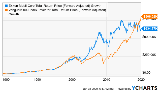
One of the first things that struck me when looking down lists of Fortune 500 companies, not just for 1980, but throughout the whole period from 1955 to 2005, is the prevalence of oil companies in the Fortune 500. In particular, the name of Exxon Mobil Corporation (XOM) was #1 on the 1980 list, second after General Motors (GM) in 1955, and second after Walmart (WMT) in 2005. I knew the name of Exxon since before the 1989 Exxon Valdez oil spill, when its ticker was still “XON”, through its 1998 merger with Mobil that resulted in the change to its current ticker. Exxon’s origin was as a company known as “Standard Oil of New Jersey” from the 1911 breakup of John D. Rockefeller’s company until it was renamed in 1972.
Although results probably would have been different for a long-time shareholder of Mobil pre-XOM, or an investor in one of the more than dozen other oil companies in the 1980 Fortune 500 list, the chart below shows XOM would have done as well as or better than VFINX until very recently.
 Data by YCharts
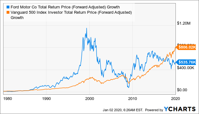
The one other industry that seemed to so persistently appear near the top of Fortune 500 lists in the 20th century were the big autos: Ford Motor Company (F, #4 in 1980), General Motors (#2), and Chrysler (#17). Of these three, only Ford has a continuous total return chart back to 1980. General Motors seems to have been at the top of more Fortune 500 lists before 1980, but because of its restructuring during the global financial crisis of 2008-2009, I will have to introduce some survivorship bias by choosing F instead. Chrysler as well has gone through mergers with Daimler and Fiat that make it harder to track than XOM.
The chart of the total return of an investment in Ford shares is more dramatic than that in Exxon Mobil: F crushed the S&P 500 through the 1980s and 1990s, then did terribly in the 2000s, and then underperformed in most of the 2010s. Investing in autos has clearly been a different game in the first two decades of this century than the last two decades of last century.
 Data by YCharts
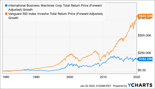
After oil and cars, we move on to the #8 largest company in 1980, and the first stock in the computers and information technology sector. International Business Machines Corporation (IBM) is one of those company names I’ve known from such an early age that I can’t think of a time I didn’t know it. IBM’s image as a stock an investor might want to own for decades is perpetuated by old sayings like “No one ever got fired for buying IBM“. If asked to describe IBM to someone in the younger generation, I might call it “the Apple of its day”.
That is why charts like the below, which seem to show IBM underperforming the S&P 500 in each of the past four decades, may seem counterintuitive.
 Data by YCharts
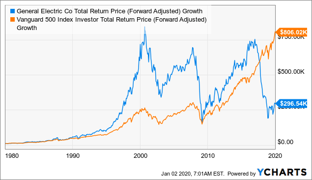
#9 on the 1980 Fortune 500 list, General Electric Company (GE) is a conglomerate long considered a “blue chip” until very recent times when it has been considered more of a “fallen angel”. It was one of the original components of the Dow Jones Industrial Average from 1896 until its removal from the blue chip benchmark index in 2018. As with Ford, it seemed to enjoy spectacular outperformance in the ’80s and ’90s, and then spectacular collapses in the 2000s and again in the late 2010s.
 Data by YCharts
Skipping a few more oil companies and one conglomerate, our next pick is #14 on the 1980 Fortune 500 list: the United States Steel Corporation (X). Possibly due to corporate actions in the 1980s, YCharts didn’t have data on X before about 1990, so we’ll have to make some assumptions to what our hypothetical investor would have done before turning $10,000 into about $8,529 in X stock over the following 30 years.
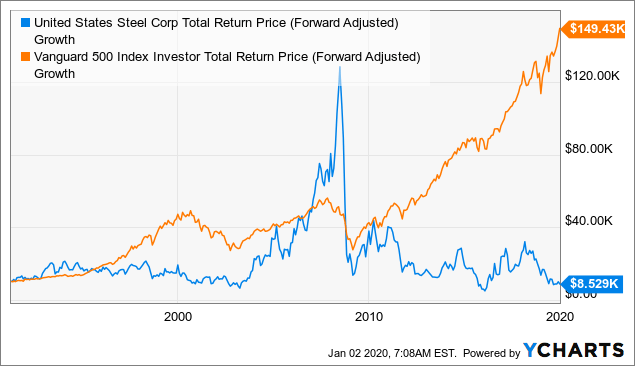 Data by YCharts
At #16 was the chemical company DuPont de Nemours Inc (DD). This stock seemed to be a steady performer from 1980 until about 2007, having apparently been unaffected by the rise and fall of the 1999-2000 dot-com bubble. Since the 2008-2009 global financial crisis, DD seems to have broadly tracked the market until recently diverging with a loss of over half its value.
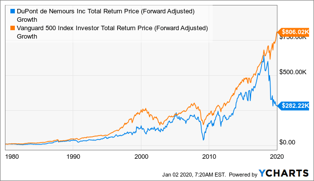 Data by YCharts
Skipping down to #23 and #61 on the 1980 list, we’ve skipped over some car companies, oil companies, and an AT&T (T) subsidiary to arrive at the first consumer staple company. Because both of these are literally household names with continuity in stock data and product lines going back all 40 years, I thought it would be worth to include both in this chart. After the first six charts, it should be some relief to finally see some stocks that have actually outperformed the S&P 500 over the 40-year period. One reason for this outperformance, as simple as it may sound, is that these two stocks are in very simple businesses that are boring, easy to understand, and based on serving simple needs that don’t change from decade to decade. It might be worth looking deeper into whether branding and marketing, conservative financial management, or other factors also helped these stocks outperform.
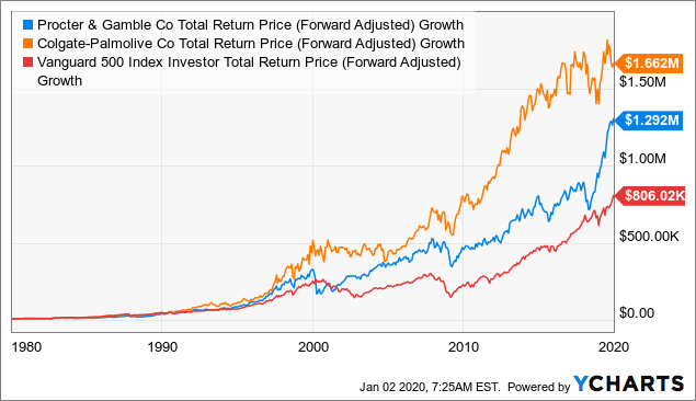 Data by YCharts
At #26 and #29, we select two “heavy industry” companies: United Technologies Corporation (UTX) and The Boeing Company (BA). Both are involved in making aircraft, although UTX makes “engines and aerospace systems” along with elevators, HVACs, and other systems, while Boeing is known for making whole airplanes like the successful 787 Dreamliner and now grounded 737-MAX. UTX seems to have been a steady but slight underperformer during the ’80s and ’90s, and a steady outperformer in the first two decades of this century. By contrast, Boeing’s total return seems to have closely tracked the S&P 500’s until only a few years ago when it more than tripled in value from late 2016 to early 2018, and has been volatile since.
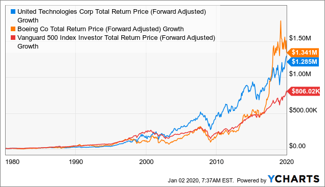 Data by YCharts
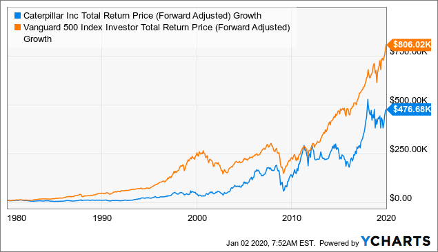
At #33, we chose Caterpillar (CAT), which is also a “heavy industrial” company, but worth getting its own slot for its association with construction rather than aircraft. This name seems to have had its best outperformance from 2000 to about 2012, but otherwise has been an underperformer.
 Data by YCharts
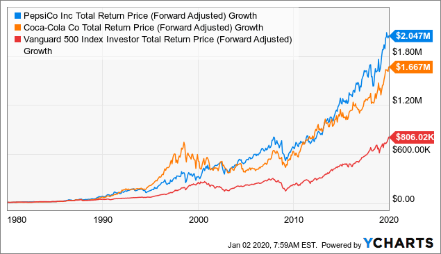
Last but not least, I wanted to skip down to find these names I know should have been on the list even in 1980, not least because the Cola wars were hard for any kid growing up in the 1980s to have missed. These two names were all the way down at #57 and #59 on the 1980 Fortune 500 list, so might be considered the most cherry-picked of all the names in this article.
 Data by YCharts
With a few mentions of Warren Buffett in this article, I thought it would only be complete to include a comparable chart of BRK.B as far back as I could get. That said, readers who have made it this far and haven’t read them already may appreciate the link to the Berkshire annual letters going back to 1977, which I highly recommend as reading for any inspiring long-term investor.
 Data by YCharts
If we started 1980 with $100,000 invested in VFINX, we would have ended 2019 with about $8,060,000. Adding up the $10,000 invested in each of the above 10 stocks (splitting $5,000 each in the three buckets with two stocks), we get:
So even with some benefit of hindsight and survivorship bias, the somewhat cherry-picked portfolio of names across 10 different industries at the top 1980’s Fortune 500 list still resulted in almost $1,000,000 of underperformance versus the same $100,000 invested in the index fund. This was not due to fees, but rather due to significant underperformance in 7 out of the 10 names, often quite dramatically as seen with GE, X, and DD.
While this may seem like a clear vindication for advocates of index funds, I will put forward a few lessons I would take away from this exercise and apply when trying to put together a long-term “buy and hope to never sell” portfolio:
Although this article was entirely backward looking, I hope this exercise and visualization of historical performance is as helpful for you as it has been for me in setting realistic expectations on what can happen to a “set and forget” single stock portfolio over many decades. I hope to be alive and healthy enough at the start of 2060 to see how a portfolio of 10 of today’s top names might compare with the index and the names I will continue to accumulate in the meantime.
This article was written by
Tariq Dennison TEP runs a registered investment adviser focused on international clients and portfolio strategies. His marketplace service “The Expat Portfolio” shares his on-the-ground experience as an expat investing in diverse foreign markets. Tariq is the author of the book “Invest Outside the Box: Understanding Different Asset Classes and Strategies”. He lives in Central Europe, and teaches two classes at the Masters in Finance program at ESSEC Business School in Singapore.
Disclosure: I am/we are long XOM, GE, PG, CL, UTX, BA, CAT, KO, PEP, BRK.B. I wrote this article myself, and it expresses my own opinions. I am not receiving compensation for it (other than from Seeking Alpha). I have no business relationship with any company whose stock is mentioned in this article.

